
Wix Answers Help Center
Widget Client SDK
Important
Improperly applying customizations with the widget client SDK can impact the Wix Answers widget experience.
The Widget Client SDK enables you to add JavaScript code to customize a Wix Answers widget that appears on your page (see Installing a Widget on Your Website), including the widget icon, tooltip, and badge, general screen appearance, user authentication, and chat. You use this SDK by adding JavaScript on the page on which the widget appears, after the widget is loaded: add the relevant JavaScript to the callback function sent as a parameter to AnswersWidget.onLoaded.
You can test the code in your browser console before entering it on your page.
The SDK enables you to access various events, such as chat started or ended, and receive the relevant info to add custom functionality.
You can test the code in your browser console before entering it on your page.
The SDK enables you to access various events, such as chat started or ended, and receive the relevant info to add custom functionality.
Note
If you have specific integration needs not met using the existing SDK, contact us at support@wixanswers.com with your request.
Methods By Subject
Method | Description |
|---|---|
Page Interaction | |
Execute a callback when the widget is loaded. This is the only method available before the widget is loaded. Add all of your other code to the listener configured for this function. | |
Display the widget. | |
Hide the widget. | |
Move the widget from the right side of the page to the left, or vice versa. | |
Set the location of the widget on the page, relative to the page corner. | |
Execute a callback function immediately after the user finishes dragging the widget. | |
Open the widget screen. | |
Execute a callback when the widget screen is opened. | |
Close the widget screen. | |
Execute a callback when the widget screen is closed. | |
Destroy the widget. | |
Icon and Tooltip Config | |
Set the launcher icon (the icon that a user presses to open the widget). | |
Set the close widget icon (the icon that a user presses to close the widget). | |
Set the contents and delay of the widget tooltip that appears when the page with the widget is first loaded. | |
Execute a callback when the tooltip is closed. | |
Configure the tooltip background, and whether to show the tooltip even when there are no unread messages. | |
Widget Config | |
Add HTML to the end of header of the widget home page. | |
Add HTML to the end of header of every category, article list, and article pages. | |
Display only the featured articles that match a search term. | |
Set the labels that are automatically added to all new tickets, chats, and callbacks. | |
Eject the widget view from a DOM element, by ID. | |
Inject the widget view into a DOM element. | |
Set custom fields for a chat, ticket, or callback. | |
Configure custom fields to display, and their dependencies. | |
Override texts in the widget. | |
Authentication and Initial Contents | |
Add an authentication function (make this widget one that authenticates users). | |
Prefill the email contact form with contents. | |
Set the user's name and/or email address, for chat, email, or callbacks. | |
Open an article in the widget screen. | |
Open a category in the widget screen. | |
Open the callback contact form in the widget screen. | |
Open the chat contact form in the widget screen. | |
Open the email contact form in the widget screen. | |
Set the articles in the featured articles section of the widget. | |
Chat Config | |
Get whether the user started a chat that was not finished and closed. | |
Execute a callback when a chat message is received. | |
Execute a callback when a chat message is sent. | |
Execute a callback when a chat starts. | |
Add a "bot message" to a chat. | |
Chatbot | |
Initiate a chatbot. For more information, see Widget Client SDK - Chatbox Feature. |
Methods Reference
AnswersWidget.addHtmlToHomePageHeader(HTML:string)
Add HTML to the end of header of the widget home page.
Returns: None
For example, the following shows a home page with an embedded SVG file.
Returns: None
For example, the following shows a home page with an embedded SVG file.
1AnswersWidget.addHtmlToHomePageHeader(html);
AnswersWidget.addHtmlToKbHeader(HTML:string)
Add HTML to the end of header of every category, article list, and article pages.
Returns: None
For example, the following shows a page with a custom header.
Returns: None
For example, the following shows a page with a custom header.
1AnswersWidget.addHtmlToKbHeader(html);
AnswersWidget.addAuthenticationFn(authFn:function)
Enable SSO Authentication
Ensure that you have enabled SSO Authentication while customizing your widget's advanced settings.
Add an authentication function. The function is called with no arguments and must return a Promise that resolves to a token string.
To learn about authenticating users in widgets see here.
Returns: None
To learn about authenticating users in widgets see here.
Returns: None
1AnswersWidget.addAuthenticationFn(authenticationFunction);
AnswersWidget.changeLauncherAlignment(alignment?: 'right' | 'left')
Move the widget to the left or right side of the page, relative to the widget's X and Y position (see AnswersWidget.setOffset). By default, the widget is on the side of the page defined by your initial settings; see Customizing Your Widget.
If alignment is not set, then the widget alignment is toggled from right to left or vice versa. If the widget starts on the right side of the page (for example), then the first time you call this method the widget moves to the left side of the page (and vice versa). The second time you call this method, the widget moves back to the right side of the page. And so forth. If alignment is right or left, the widget is moved to the right or left side of the page, respectively.
If the user has dragged the widget, changes made to the side margin are reset; however, changes made to the bottom margin remain. The position set by setOffset is now interpreted to be from the left side of the page instead of from the right.
Returns: None
1AnswersWidget.changeLauncherAlignment('right');
AnswersWidget.close()
Close the widget screen.
Returns: None
Returns: None
1AnswersWidget.close()
AnswersWidget.destroy()
Destroy the widget.
Returns: None
Returns: None
1AnswersWidget.destroy()
AnswersWidget.ejectFromElementById(DOM-ID:string)
Eject the widget view from a DOM element, by ID.
Returns: None
Returns: None
1AnswersWidget.ejectFromElementById(DOM_ELEMENT_ID)
AnswersWidget.featuredArticlesSearch(searchTerm:string)
Display only the featured articles that match the search term. You configure featured articles in the Wix Answers app when configuring the widget. This method enables you to display relevant articles only, based on the page topic (for example).
Returns: None
Returns: None
1 2 3 4 5AnswersWidget.featuredArticlesSearch(searchTerm) // For example AnswersWidget.featuredArticlesSearch("electronics")
AnswersWidget.fillContactForm({subject: subject:string, description: description:string})
Prepopulate the email contact form with a subject and/or description. Also see AnswersWidget.goToContact.
Returns: None
Returns: None
1 2 3 4 5AnswersWidget.fillContactForm({subject: subject, description: description}) // For example AnswersWidget.fillContactForm({subject: 'This is the subject', description: 'This is description'})
AnswersWidget.goToArticle(article:GUID)
Open an article in the widget screen.
Returns: None
Returns: None
1AnswersWidget.goToArticle(ARTICLE_ID)
AnswersWidget.goToCallback()
Open the callback contact form in the widget screen.
Returns: None
Returns: None
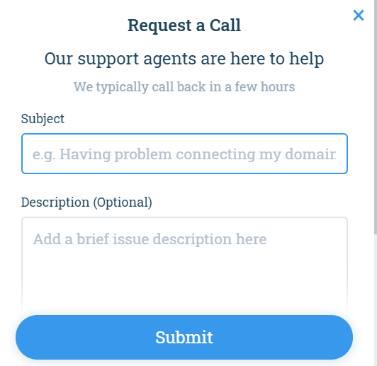
1AnswersWidget.goToCallback()
AnswersWidget.goToCategory(category:GUID)
Open a category in the widget screen.
Returns: None
Returns: None
1AnswersWidget.goToCategory(CATEGORY_ID)
AnswersWidget.goToChat(ticketId:GUID)
Open the chat contact form in the widget screen. If ticket is not specified, a new ticket is created. Otherwise, the chat is associated with the specified ticket.
Returns: None

1AnswersWidget.goToChat()
AnswersWidget.goToContact()
Open the email contact form in the widget screen. Also see AnswersWidget.fillContactForm.
Returns: None
Returns: None
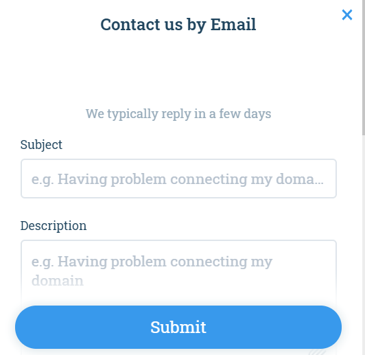
1AnswersWidget.goToContact()
AnswersWidget.hasActiveChatConversation()
Get whether the user started a chat that was not finished and closed. A return of false indicates that no chat was started, or any chats have been closed.
Returns: Promise that resolves to a Boolean
Returns: Promise that resolves to a Boolean
1 2 3 4 5 6 7var result = await AnswersWidget.hasActiveChatConversation(); // or AnswersWidget.hasActiveChatConversation().then(function(result){ // do something with result })
AnswersWidget.hide()
Hide the widget.
Returns: None
Returns: None
1AnswersWidget.hide()
AnswersWidget.identifyUser({name: username:string, email: email-address:string})
Set the user's name and/or email address, for chat, email, or callbacks.
Returns: None
Returns: None
1AnswersWidget.identifyUser({email: 'iknowyouremail@gmail.com'});
AnswersWidget.injectToElementById(DOM-ID:string)
Inject the widget view into a DOM element. The DOM element must be empty.
Returns: None
Returns: None
1AnswersWidget.injectToElementById(DOM_ELEMENT_ID)
AnswersWidget.onChatMessageReceived(listener:function)
Execute a callback when a chat message is received.
Returns: None
Returns: None
1AnswersWidget.onChatMessageReceived(callback);
The callback is called with the following parameters:
1 2 3 4 5 6{ messageId: <GUID>, ticketId: <GUID>, agentMessageIdx: <integer>, // The number message from the agent agentId: <GUID> }
AnswersWidget.onChatMessageSent(listener:function)
Execute a callback when a chat message is sent.
Returns: None
Returns: None
1AnswersWidget.onChatMessageSent(callback);
The callback is called with the following parameters:
1 2 3 4 5 6{ messageId: <GUID>, ticketId: <GUID>, userMessageIdx: <integer>, // The number message from the user isFile: <Boolean> // Whether the message is a file }
AnswersWidget.onChatStarted(listener:function)
Execute a callback when a chat starts.
Returns: None
Returns: None
1AnswersWidget.onChatStarted(callback);
The callback is called with the following parameters:
1 2 3{ ticketId: <GUID> }
AnswersWidget.onDragEnd(listener:function)
Execute a callback function immediately after the user finishes dragging the widget.
Returns: None
Returns: None
1AnswersWidget.onDragEnd(callback)
The callback is called with the following parameters:
1 2 3 4{ x: <integer>, // Target X offset from page corner, in pixels y: <integer> // Target Y offset from page corner, in pixels }
AnswersWidget.onLoaded(listener:function)
Execute a callback when the widget is loaded.
This is the only method available before the widget is loaded. Add all of your other code to the listener configured for this function.
Returns: None
This is the only method available before the widget is loaded. Add all of your other code to the listener configured for this function.
Returns: None
1 2 3window.AnswersWidget.onLoaded(function() { window.AnswersWidget.goToArticle('1324-13425-13542-1r4526'); } );
AnswersWidget.onTooltipClosed(listener:function)
Execute a callback when the tooltip is closed.
Returns: None
Returns: None
1AnswersWidget.onTooltipClosed(callback);
AnswersWidget.onWidgetClosed(listener:function)
Execute a callback when the widget screen is closed.
Returns: None
Returns: None
1AnswersWidget.onWidgetClosed(callback);
AnswersWidget.onWidgetOpened(listener:function)
Execute a callback when the widget screen is opened.
Returns: None
Returns: None
1AnswersWidget.onWidgetOpened(callback);
AnswersWidget.open()
Open the widget screen.
Returns: None
Returns: None
1AnswersWidget.open()
AnswersWidget.sendChatMessage({content: message:string})
Add a "bot message" to a chat.
Returns: None
Returns: None
1AnswersWidget.sendChatMessage({content: 'Your message goes here'});
AnswersWidget.setCustomFields({field-name:string : value:*, ...})
Set custom fields for a chat, ticket, or callback. * The value types depend on the custom field.
Returns: None
Returns: None
1AnswersWidget.setCustomFields({firstFieldName: 'first field value', secondFieldName: 'second field value'});
AnswersWidget.setCustomFieldsConfiguration(dependency_list:list of trees of custom fields and their dependencies)
Set custom fields to appear on the widget, as well as any field dependencies. The dependencies enable you to define which custom fields appear on the widget depending on the values selected in other custom fields on the widget.
If you do not call this method, all custom fields appear on the widget without any dependencies. If you call this method, only the specified fields appear on the widget.
The input is a list of structures, each one defining a field and optionally its dependencies. To have a field appear in all cases, not as a dependency, it must be at the top level in one of these structures. To have it appear as a dependency, it must be within a dependentFields sublevel.
Dependencies can be cascaded; in other words, you can configure field-B to appear only if a certain value is selected for field-A and for field-C to appear only if a certain value is selected for field-B.
Note
Each custom field MUST NOT appear more than once. In other words, each field must a) not appear, b) be a top level field, or c) be a dependent field of exactly one other field.
Structure:
{
Display the following field on the widget
id: custom field name (string) For example, field-A
required: Boolean Overrides mandatory setting defined for field-A
dependentFields: {
The list of other fields to display on the widget depending on the value selected for field-A
<value>: [{
id: custom field name (string) For example, field-B
required: Boolean Overrides mandatory setting defined for field-B
dependentFields: { ... }
}, ...],
...
}
}
For example, if <value> is 5, then field-B appears on the widget only if 5 if selected for the value in field-A. If the value is changed to something other than 5, the dependent fields are rehidden. Values in hidden fields are not submitted with the widget form.
If you run this before the widget is loaded, it will take effect when the widget is loaded.
For the list of form fields, see Setting Up a Contact Form in Your Widget. To find custom field names, see Finding a Custom Field Name.
Returns: None
In the following example, the custom field OS Type appears on the widget. When the user selects Windows as a value for this field, the field Windows Version appears. When the user selects XP as a value for the Windows Version field, the field Patch Level appears. None of the fields are mandatory fields.
In the following example, the custom field OS Type appears on the widget. When the user selects Windows as a value for this field, the field Windows Version appears. When the user selects XP as a value for the Windows Version field, the field Patch Level appears. None of the fields are mandatory fields.
1 2 3 4 5 6 7 8 9 10 11 12 13 14 15 16 17 18 19 20 21 22AnswersWidget.setCustomFieldsConfiguration([ { id: 'os-type', required: false, dependentFields: { Windows: [ { id: 'windows-version', required: false, dependentFields: { XP: [ { id: 'patch-level', required: false, } ] } } ] } } ]);
AnswersWidget.setFeaturedArticles([id:GUID, ...])
Set the articles that appear in the Featured Articles area of the widget.
Returns: None
1AnswersWidget.setFeaturedArticles(['12345678-5107-428f-bfa9-263738265adb'])
AnswersWidget.setLabels([label:GUID, ...])
Set the labels that are automatically added to all new tickets, chats, and callbacks.
Returns: None
Returns: None
1AnswersWidget.setLabels(["bd948e62-a3fd-4cf0-87f3-ee6a0ae7f3fa","e932c0a3-6e9b-43cf-b3a9-0ae790f6ee6a"])
AnswersWidget.setLauncherCloseIconSvg(SVG:string)
Set the icon that a user touches to close the widget. The parameter is an SVG content string.
Returns: None
1AnswersWidget.setLauncherCloseIconSvg(svg)
AnswersWidget.setLauncherIconSvg(SVG:string)
Set the launcher icon, the icon that a user touches to open the widget. The parameter is an SVG content string.
Returns: None
1AnswersWidget.setLauncherIconSvg(svg)
AnswersWidget.setOffset(X-pos:integer,Y-pos:integer)
Set the location of the widget on the page, relative to the page's bottom corner. Depending on your alignment settings (see AnswersWidget.changeLauncherAlignment; see also Customizing Your Widget), X-pos is from the right or left side of the page. Y-pos is from the bottom of the page. X and Y can be positive or negative.
This overrides the offset defined by your initial settings.
Returns: None
1AnswersWidget.setOffset(300,500)
AnswersWidget.setOverrideTexts({text-field-name:string : value:string, ...})
Override texts in the widget.
You can find the text field names in the Help Center at Settings > Support Channels > Widgets; select the Help row; select the Advanced tab; in Language Text Settings, select Edit (or navigate to https://<tenant_subdomain>.wixanswers.com/app/settings/widgets/{GUID}/advanced/{locale}/texts).
The input structure is a map of field names to values.
Returns: None
1 2 3 4AnswersWidget.setOverrideTexts({ "widget-v3.widget-launcher.icon-message": "Hi!", "widget-v3.widget-home.contact-button.contact-title": "Contact Us!" })
AnswersWidget.setTooltipConfig(tooltip-text:string, delay-in-seconds:integer)
Set the contents and delay of the widget tooltip that appears when the page with the widget is first loaded. The default delay is 0.
Returns: None
Returns: None
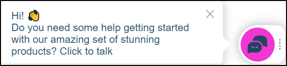
1AnswersWidget.setTooltipConfig(tt_content,2)
AnswersWidget.setUnreadMessageConfig(background-color:string,show-on-no-unread:Boolean)
A badge with the unread message count may appear when the user closes the widget when there is an active chat in progress. Use this to configure the tooltip background, and whether to show the tooltip even when there are no unread messages (the default is false}.
Returns: None
Returns: None
1AnswersWidget.setUnreadMessageConfig("#ffffff",true)
The default background color is #389eec.
For example, the closed widget appears as follows if there are no unread messages, and the second argument is set to true.
For example, the closed widget appears as follows if there are no unread messages, and the second argument is set to true.
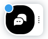
The closed widget appears as follows if there are two unread messages.

AnswersWidget.show()
Display the widget. Any changes made to the widget's position before the widget closed remain.
Returns: None
1AnswersWidget.show()
Was this article helpful?